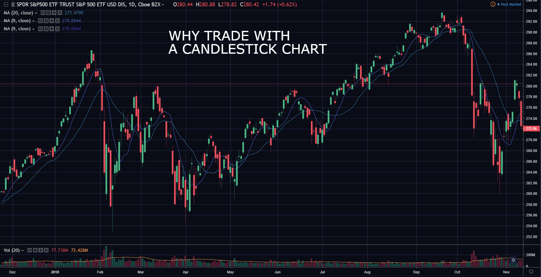
What is a Candlestick Chart?
Candlestick charts are a tool for displaying market data. The candlesticks on the chart display the high, low, open and close prices for the time period chosen by the trader. Candlestick charts can go as low as a 1-minute chart, and go as large as a monthly chart. On a 1-minute chart, each candle represents 1 minute worth of price action. On a monthly chart, each candle represents 1 month worth of price action. A candlestick chart is a crucial tool used by active momentum traders, and is essential for conducting technical analysis. Candlestick charting is a great way to display a stock’s price action history.Breaking Down A Candlestick
Each candlestick on a chart carries a ton of information about the data and trend of a market. It is a great gauge of market sentiment and trend of the timeframe you are looking at. A candle s composed of a top wick, a body, and a bottom wick. Here is a diagram of what a candlestick looks like: A green candle is a bullish candle, meaning that buyers are in control for that period, since the candle closed higher than the open. A red candle is a bearish candle indicating that sellers are in control, as the candle closed lower than it opened.
Understanding Wicks
Wicks are an indicator of where price traded during the time period of the candle. A green candle with a bottom wick is considered to be a bullish sign, since it rejected lower price levels and went higher during that time period. A top wick is potentially a bearish sign, since the stock tried to push towards higher price levels and got rejected, and closed lower. Here are examples of both below: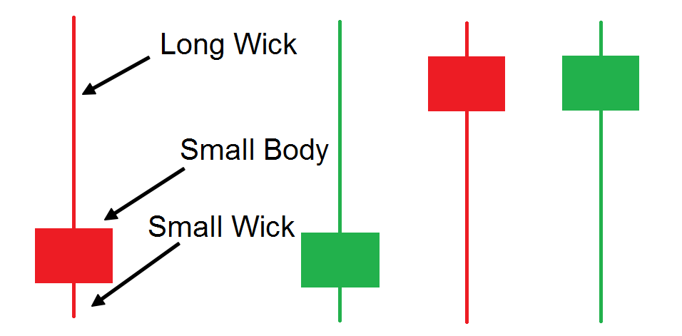 Pay close attention to the wicks on a candlestick, as they are often indicators of trend changes in the stock on higher time frames. If you interested in how we setup our candlestick charts for trading, you can learn everything in this article here.