Charting allows us to see the actions of all traders in graphical format. It is the tool that takes what looks like random, chaotic data and forms it into a concise picture. We use them to determine not only where a stock has been but where it is going. In this article we will discuss what indicators can be used to confirm positive price action and exactly how to use them. You will also learn how to read volume and how it relates to price on a chart.
Chart Setup
The primary component of any chart is price. A chart allows the collective actions of traders to be represented in a picture. When setting up your chart, your first consideration is how the price data will be represented. The three most common options are candlestick, line, and bar/OHLC. Like the majority of active traders today, I use and recommend candlestick charts, because they provide a concise yet robust representation of price data that can be quickly understood. Here is what a candle looks like:
Each candlestick, regardless of whether it represents one minute or one week of price data, has an open and a close. The section of the candle between the open and the close is called the “real body”. If the close is higher than the open, the real body of the candlestick will be colored green, to represent a price increase. If the close is lower than the open, it will be colored red to represent a price decrease. Additionally, many candlesticks will have an upper or lower “shadow”, sometimes referred to as a “wick”. These shadows represent price action that occurred outside of the opening and closing prices.
Volume
After price, volume is the most important component of a chart. The volume illustrates the number of shares that were traded in the specified period of time. This provides the trader with several important pieces of information:
- Is the stock liquid enough to allow for easy entries and exits?
- Is current volume higher or lower than average?
- Are more shares being accumulated or distributed?
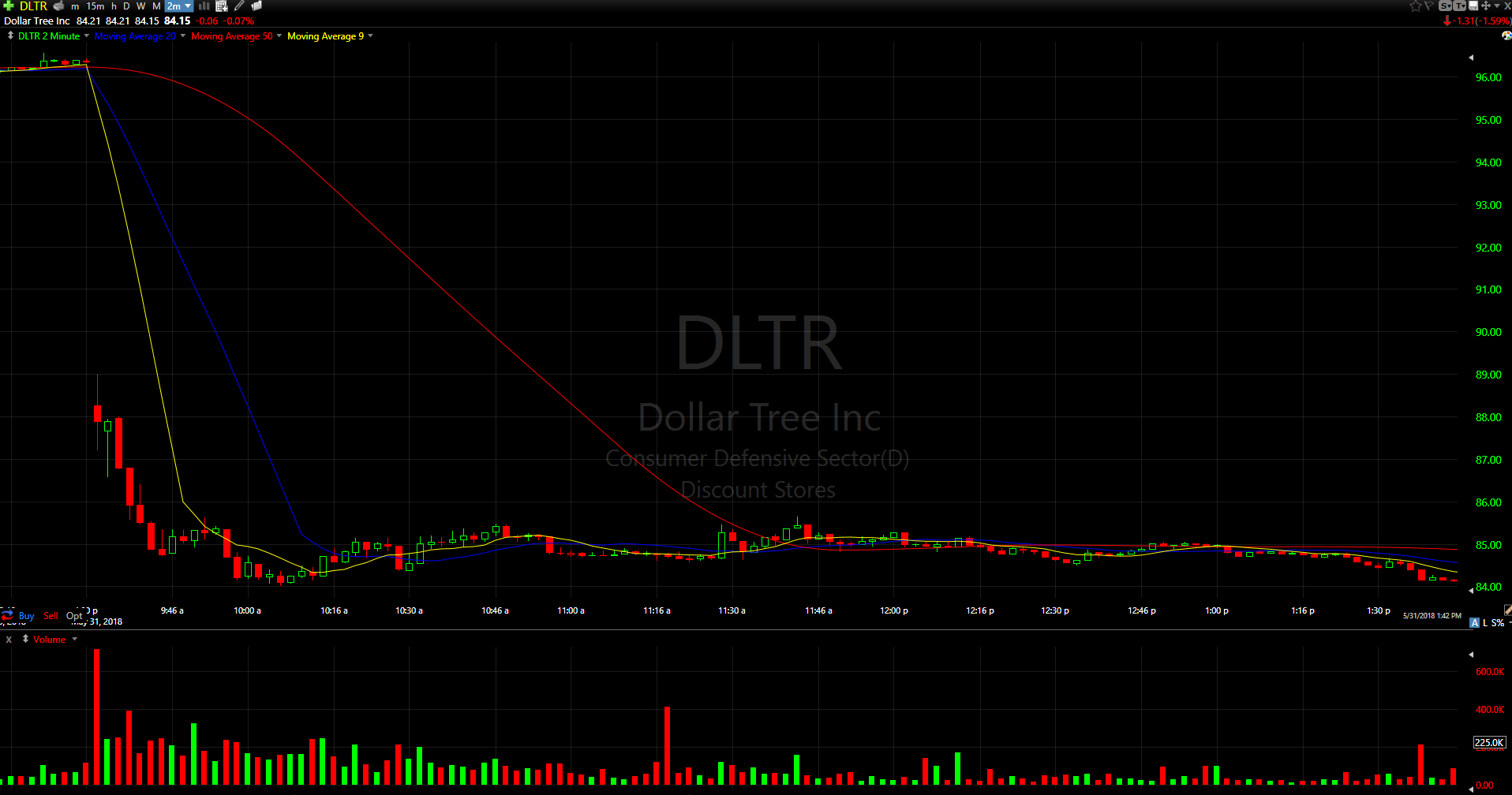
The most common way to display volume is a bar at or near the bottom of the chart. Each candlestick will have a corresponding volume bar that illustrates the number of shares exchanged for that period of time. Many brokers and charting services will display green and red volume bars. A green volume bar is for a period of time in which the closing price was higher than the previous closing price, and a red volume bar is for when the closing price was lower than the previous closing price. This allows you to quickly see if there is more volume when a stock is moving up or moving down. See the example on the chart below:
When evaluating a stock for an entry, it is important to look at the volume pattern. For a long position, it’s good to see high volume on up days and low volume on red days. This indicates that momentum is on the side of the bulls. The reverse is true for a short position: the ideal short candidate will have stronger volume on down days.
Moving Averages
A moving average is the mean of a stock’s price for a specified period of time. For example, a 20-point moving average drawn on a daily chart, will represent, in the form of a line, the average of the last twenty days price. On a five minute chart, the same moving average would the average of the last 20, 5-minute candles.
Moving averages come in two basic forms: simple and exponential. An exponential moving average (EMA) averages the specified number of data points, but gives more weight to recent price action. A simple moving average (SMA) does not weight the data based on recency. We use moving averages for two purposes:
- To help identify trends
- To provide areas of support and resistance
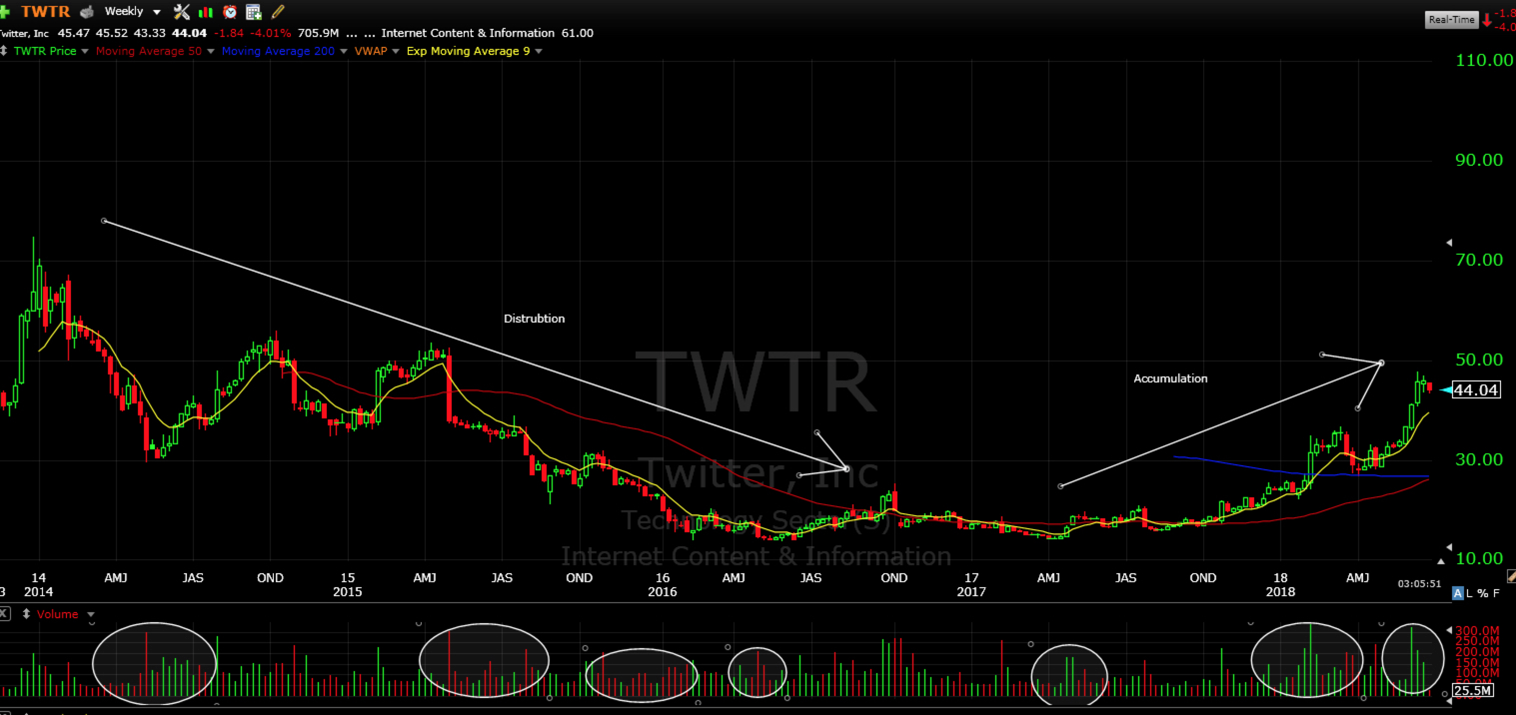
Stocks spend only a small portion of their time in a trending environment. Often they are range bound, consolidating for the next move up or down. Moving averages can help identify trends on different time frames:
20 SMA = Short-term trend
50 SMA = intermediate trend
200 SMA= long-term trend
See an example of how moving averages influence a stock’s trend on the chart below:
Intraday vs Daily Charts
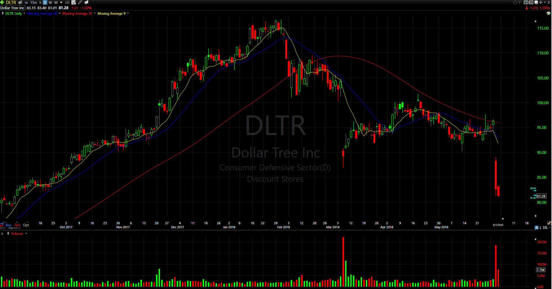
As day traders and swing traders, it’s important to use both the daily and intraday charts to plan and execute your trades. The Bulls method begins with daily chart of 3-6 months’ time. Candlestick charts, volume, and the 20,50,200 SMAs are all included.
The daily chart is used for idea generation. It illustrates the longer term trend of a stock and is the starting point of compiling a watch list of stocks to potentially trade in upcoming sessions. All trade ideas you have should be based on trades on the daily time frame, aligned with a trend on the short-term, intraday time frame. We use 5-minute charts for day trading to get an idea of the short term time frame. For an intermediate time frame, we use the 10-day, 30-minute chart. This time frame is mainly used for swing trading.
Sign Up For The Free 4-Day Live Course
If you missed our last post of the Bulls Elite Series about technical analysis basics, you can check it out here. We will go in more depth about all the components of technical analysis and charting in our free 4 day live course on July 22nd.
Reserve your seat for the free 4-day live course here.

PS if you’re coming let us know on Facebook and share this event with your friends. Click here to join our Facebook event.
[rf_contest contest=’10758′]